Why Thumbnails Matter More Than Most Creators Realise
A 1% improvement in click-through rate does not sound dramatic — but it has compound effects. A video with 5% CTR versus 4% CTR receives meaningfully more distribution from YouTube's algorithm, because YouTube shows higher-CTR videos to more people. Over a full video's lifetime, that 1% difference can represent tens of thousands of additional views.
More importantly: a weak thumbnail limits the reach of otherwise excellent content. A video that took 8 hours to produce and edit, with useful information and good production quality, can underperform because its thumbnail fails to earn the click. The thumbnail is the gatekeeper — no viewer sees your content until they click, and they only click if the thumbnail gives them a reason.
YouTube itself has stated that thumbnails are the most important factor in getting views. This is not hyperbole — it is reflected in how the algorithm works. CTR (driven primarily by thumbnails) is one of the first signals YouTube uses to determine whether to distribute a video broadly or limit it to a small audience.
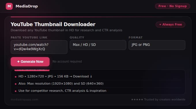
Study your competitor thumbnails by downloading them with YouTube Thumbnail Downloader. Looking at your competitors' highest-performing thumbnails side by side reveals the visual patterns that your specific niche's audience responds to.
The Psychology of Why Certain Thumbnails Get Clicked
Thumbnail effectiveness is not arbitrary — it follows predictable psychological patterns. Understanding why thumbnails work makes it possible to create them intentionally rather than hoping for good results.
Human faces and expressions drive the most clicks
This is the most consistently supported finding in YouTube CTR research. Thumbnails featuring a human face with a genuine emotional expression — curiosity, surprise, excitement, concern, joy — outperform thumbnails without faces across virtually every content category. The human brain is hardwired to process faces and emotional expressions before other visual information. A face creates immediate emotional context and makes the viewer unconsciously curious about what caused that expression.
The expression must be genuine and match the video's content. A forced, fake-surprised face that does not relate to the video's content is less effective than a neutral but relevant visual. The expression should make sense in the context of what the video delivers.
Curiosity gaps keep people clicking
Thumbnails that show part of a story but withhold the conclusion create an unresolved tension that the brain seeks to resolve by clicking. A before image without the after. A problem without the solution. An interesting object that is not immediately identifiable. The viewer clicks to close the gap.
This is why reaction thumbnails (a face reacting to something shown or implied) perform consistently well — the viewer wants to know what caused the reaction. The same applies to 'result reveals' where only the process or the surprising result is shown but not both.
Contrast and visual pop
YouTube's browse feed shows your thumbnail surrounded by competitor thumbnails. Your thumbnail does not exist in isolation — it competes for attention. The thumbnails that naturally draw the eye are those with the highest contrast relative to their surroundings.
Study the thumbnails in your niche and identify the dominant color palette — then intentionally use a color that contrasts with it. If your niche is dominated by blue and dark thumbnails, a bright orange or yellow thumbnail stands out. If everyone uses busy, cluttered thumbnails, a clean minimal design stands out.
Text reinforces but should not duplicate the title
A common thumbnail mistake is using on-screen text that simply repeats the video title. The title is already visible below the thumbnail — the thumbnail text should add new information or emphasise a different angle. Maximum 4–5 words, large and legible enough to read at the small sizes thumbnails appear at in search results.
YouTube Thumbnail Technical Requirements
Getting the technical specifications right ensures your thumbnail looks its best across every context where YouTube displays it — search results, the homepage, suggested videos, and mobile feeds.
| Specification | Requirement |
|---|---|
| Dimensions | 1280 × 720 pixels |
| Aspect ratio | 16:9 |
| Maximum file size | 2MB |
| Supported formats | JPG, PNG, GIF, WebP |
| Minimum dimensions | 640 × 360 pixels |
Use YouTube Thumbnail Resizer to resize any image to the exact 1280×720px specification. Use Image Compressor to reduce file size below 2MB if needed without visible quality loss.
Important note about safe zones: YouTube adds black bars to thumbnails that do not perfectly match the 16:9 ratio on certain devices. More critically, the play button overlay and other UI elements appear in the center of the thumbnail. Avoid placing critical text or the main focal point in the very center of the thumbnail — place your face or key visual slightly left or right of center, and keep important text in the upper or lower thirds.
Step-by-Step: Creating a High-CTR Thumbnail
Here is the process for creating thumbnails that consistently perform well:
Step 1: Choose the right base image
For most content, the base image is a screenshot from your video or a dedicated photo taken during filming. Capture the frame or take the photo at a moment of genuine expression — the moment in the video where your face best reflects the emotional hook of the content. Take 10–20 photos or screenshots and choose the one where the expression is most genuine and engaging.
Step 2: Apply the background
Remove the background from your photo using Background Remover and place the subject against a background that contrasts with your face and stands out in your niche's color palette. Options: solid bright color, gradient, relevant environment screenshot, or branded background. Keep the background simple — complex backgrounds compete with the subject for visual attention.
Step 3: Add text (if used)
Maximum 4–5 words. Large font — test that the text is readable at 480×270px (a quarter of full size — roughly how it appears in search results). Use a font that matches your channel's brand identity. Add a dark shadow or outlined stroke to text if it overlaps with complex background areas, to ensure it remains legible.
Step 4: Apply visual enhancements
Increase brightness slightly (thumbnails look darker on-screen than in editing tools), increase contrast, and bump saturation by 15–25%. These adjustments make thumbnails 'pop' in the feed. Use Thumbnail Enhancer to apply these adjustments automatically with one-click presets optimised for YouTube thumbnails.
Step 5: Test at small sizes before uploading
Zoom your thumbnail preview to 10–15% of its full size. At this scale, you are seeing approximately how it appears in YouTube search results on a desktop. The main element should still be clear and the text (if present) should still be legible. If critical elements are not clear at this scale, simplify the design.
How to Test and Improve Your Thumbnails Over Time
Even experienced creators improve their thumbnails through systematic testing. The two available methods:
YouTube's built-in A/B testing (YouTube Experiments)
YouTube's Experiments feature (available in YouTube Studio for eligible channels) allows you to test two different thumbnails for the same video. YouTube shows each thumbnail to a portion of your audience and reports which generates higher CTR. This is the most accurate way to test thumbnails because it controls for all other variables.
Manual testing
For channels without A/B testing access: change the thumbnail on an underperforming video and compare CTR before and after the change (allow 7–14 days after the change for the new data to be meaningful). Track which thumbnail designs consistently outperform others in your niche.
The key metric to track
YouTube Studio shows Click-Through Rate under the Analytics tab for each video. This is the definitive measure of thumbnail performance. Track CTR for every video, identify the thumbnails on your highest-CTR videos, and reverse-engineer what made them work. Systematically apply those elements to future thumbnails.
Download thumbnails from your best-performing videos (and your competitors' best videos) using YouTube Thumbnail Downloader for side-by-side comparison in your analysis.
Common Thumbnail Mistakes to Avoid
Too much text: Thumbnails with 10+ words of text are hard to read at small sizes and compete with the visual for attention. Maximum 5 words — ideally 3.
Clickbait that the video does not deliver: A sensational thumbnail that sets expectations the video does not meet produces high initial CTR but low watch time and poor audience satisfaction scores. YouTube measures this correlation and penalises videos where CTR is high but watch time is low. Thumbnails and titles must be honest about what the video delivers.
Inconsistent style across videos: A recognisable thumbnail style builds channel brand — returning viewers recognise your content before reading the title. Inconsistent thumbnail styles miss this opportunity. Develop a template that maintains consistent fonts, colors, and layout while varying the specific image and text.
No human element: Videos in niches that seem to not need faces (cooking, finance, DIY) often still benefit from a human presence in the thumbnail. The creator's face reacting to the finished dish, holding the product, or gesturing toward the subject performs better than just showing the subject alone in most niches.
Dark or low-contrast images: Thumbnails that are too dark or have low visual contrast disappear in the feed. YouTube feeds show bright, high-contrast thumbnails more prominently in the viewer's visual attention. If your source image is dark, increase exposure significantly in editing.
Conclusion
A strong YouTube thumbnail is the result of understanding your niche audience, applying psychological principles that drive clicks, maintaining consistent brand identity, and systematically testing and improving based on CTR data. None of this requires expensive design software — the process described in this guide is achievable with free browser tools and a thoughtful approach.
Start by downloading and studying the thumbnails of your top 5 competitor channels using YouTube Thumbnail Downloader. Identify the visual patterns their highest-performing thumbnails share. Then apply those patterns to your own brand style, test the results through YouTube's CTR analytics, and iterate from there.
The investment in better thumbnails pays back in more views from the exact same content — which is the most efficient growth lever available to any YouTube creator.